
Last Updated on May 14, 2026 by Admin
Every planning engineer knows the drill. You spend hours extracting schedule data from Primavera P6 or Microsoft Project, copy-pasting numbers into Excel, formatting pivot tables, and manually building charts for your weekly progress report. By the time the report reaches the project manager’s desk, the data is already a day old and the formatting has broken in at least two places.
ConstructionCareerHub App is LIVE — built ONLY for construction careers. Don’t apply with a weak resume.
Get ATS-ready Resume Lab + Interview Copilot + Campus Placement Prep (resume screening, skill gaps, interview readiness) — in minutes & Other advanced features.
Explore Smarter Construction Career Tools →Quick check. Big impact. Start now.
Explore Smarter Construction Career Tools →
Table of Contents
Why Data Analytics Matters for Planning Engineers in 2026
The construction industry is undergoing a fundamental shift in how project data is consumed and acted upon. Clients, PMCs, and EPC contractors no longer accept static PDF reports delivered at the end of each month. They expect interactive dashboards that allow them to drill into schedule performance, filter by work package, and identify bottlenecks in real time.
For planning engineers, this shift creates both a challenge and a tremendous career opportunity. Here is why analytics proficiency — and Power BI specifically — has become a career differentiator:
Reporting speed. A well-built Power BI dashboard refreshes in seconds. What used to take a planning engineer four to six hours of manual report preparation can be reduced to a single click once the data model is configured. This frees up time for actual schedule analysis, delay mitigation planning, and stakeholder communication — the high-value work that drives career growth.
Data consolidation. Construction projects generate data across multiple systems — Primavera P6 for scheduling, Excel for BOQs and billing, SharePoint for document management, ERP systems for procurement. Power BI connects to all of these sources and consolidates them into a single reporting layer. Planning engineers who can build this consolidated view become indispensable to their project teams.
Stakeholder communication. Interactive dashboards tell a story that static tables cannot. When a planning engineer presents an S-curve that a project director can click to filter by zone, phase, or subcontractor, decision-making quality improves dramatically. This presentation capability is increasingly listed as a requirement in planning engineer interview questions across the Gulf and Indian markets.
Career advancement. The gap between a “scheduler” and a “project controls professional” increasingly comes down to analytics capability. Planning engineers with Power BI skills command a 15 to 30 percent salary premium in markets like Dubai, Riyadh, Mumbai, and Doha. Employers value candidates who can not only create and update schedules but also translate schedule data into visual insights for management decision-making. For current salary benchmarks, refer to our highest-paying construction jobs guide.
Industry demand. Job postings for planning engineers and project controls professionals increasingly list Power BI, Tableau, or “data analytics” as a preferred or required skill. Major EPC contractors, including Bechtel, Fluor, Samsung Engineering, and L&T, have standardised on Power BI for internal project reporting. Even mid-sized Indian contractors are now asking planning engineers to submit weekly dashboards rather than traditional Excel reports.
Power BI Dashboards for Planning Engineers
A planning engineer’s Power BI work typically centres on schedule performance, progress tracking, and earned value analysis. These are the dashboards that deliver the most impact for planning teams:
1. Project S-Curve and Progress Dashboard
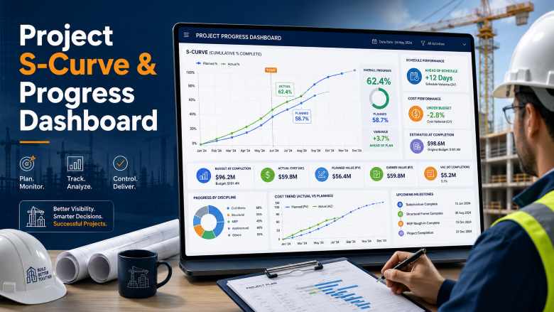
The S-curve is the planning engineer’s signature visualisation. In Power BI, you can build an interactive S-curve that plots planned progress, actual progress, and forecasted completion on the same chart. The dashboard should include cumulative planned percentage complete (from the baseline schedule), cumulative actual percentage complete (from weekly progress updates), a variance indicator showing whether the project is ahead or behind, and drill-down capability by work package, zone, discipline, or subcontractor.
The key data source is your Primavera P6 or MS Project schedule, exported to Excel or CSV. The planned curve comes from your baseline activity dates and weights, while the actual curve comes from your periodic progress updates. DAX measures in Power BI calculate cumulative percentages and variance metrics automatically.
2. Earned Value Management (EVM) Dashboard
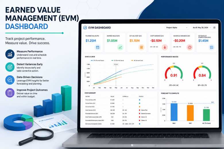
Earned value is the gold standard for project performance measurement, and Power BI makes EVM metrics far more accessible than traditional spreadsheet calculations. Your EVM dashboard should display the three core metrics — Planned Value (PV), Earned Value (EV), and Actual Cost (AC) — along with the derived KPIs: Schedule Performance Index (SPI), Cost Performance Index (CPI), Schedule Variance (SV), Cost Variance (CV), Estimate at Completion (EAC), and Variance at Completion (VAC).
In Power BI, you can build gauges that turn red when SPI falls below 0.95 or CPI drops below 1.0, giving project managers an instant visual signal of performance. Trend charts showing SPI and CPI over time reveal whether performance is improving or deteriorating — a critical insight for project recovery planning.
3. Look-Ahead Schedule Dashboard
The three-week or four-week look-ahead is one of the most frequently produced planning documents on any construction site. In Power BI, this becomes a filterable table with colour-coded status indicators, linked to a bar chart showing the volume of activities by discipline and by week. Site teams can filter by contractor, by zone, or by trade to see exactly what work is planned in the upcoming period.
4. Delay Analysis and Critical Path Dashboard
Delay tracking in spreadsheets is notoriously difficult to maintain. A Power BI delay analysis dashboard can categorise delays by cause (client, contractor, weather, design change), track delay duration trends over time, highlight activities on the critical path that have slipped, and link delay records to their schedule impact. This dashboard becomes invaluable during extension of time (EOT) claim preparation and project close-out reporting.
5. Resource Loading and Manpower Dashboard
Resource histograms — comparing planned manpower against actual deployment — are essential for site management. In Power BI, the resource dashboard pulls data from daily manpower logs (often maintained in Excel) and compares actual numbers against the resource-loaded schedule from P6. Filters allow breakdowns by trade, subcontractor, zone, and time period. Equipment utilisation rates can be tracked on the same dashboard.
Power BI Dashboards for Quantity Surveyors
Quantity surveyors and cost engineers benefit enormously from Power BI, particularly for cost monitoring and contract administration. The key dashboards include:
6. Cost Variance and BOQ Consumption Dashboard
This dashboard tracks budgeted cost versus actual expenditure across all BOQ items, highlights items where spending exceeds the budgeted rate, monitors material consumption rates against planned quantities, and provides forecasted final cost based on current burn rates. The data typically comes from Excel-based BOQ trackers and procurement records. Quantity surveying courses are increasingly including Power BI modules to prepare graduates for this type of reporting.
7. Variation and Claims Tracker Dashboard
Tracking variation orders, claims, and contract amendments in spreadsheets quickly becomes unwieldy on large projects. A Power BI dashboard can display claim status (submitted, under review, approved, rejected), variation order values and their impact on the contract sum, ageing analysis showing how long claims have been pending, and cumulative variation impact on project cost.
Power BI Dashboards for Billing Engineers
Billing engineers handle the financial heartbeat of construction projects. Power BI dashboards for billing focus on:
8. Running Account Bill (RA Bill) and Payment Dashboard
This dashboard tracks cumulative billing versus cumulative work done, payment certification status and pending amounts, retention money tracking and release schedules, and cash flow projections based on billing forecasts. The visual impact of showing a project manager exactly where payments are stuck — and for how long — makes this one of the most appreciated dashboards on any project site.
9. Subcontractor Payment Dashboard
For main contractors managing multiple subcontractors, a consolidated payment dashboard shows billing submitted versus billing certified for each subcontractor, work-done percentage versus payment percentage, and outstanding payment ageing by subcontractor. This consolidation saves billing engineers hours of manual compilation each month and gives commercial managers a real-time view of financial commitments.
Sample Workflows: From Raw Data to Dashboard
Understanding dashboard concepts is one thing — actually building one is another. Here are three practical workflows that planning engineers can replicate on their own projects.
Workflow 1: Weekly Progress Dashboard from Primavera P6
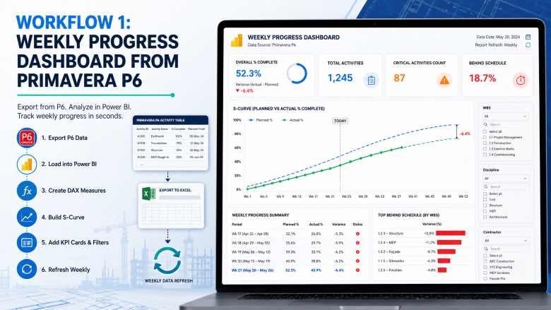
Step 1 — Export data from P6. Open your Primavera P6 project, navigate to the Activities view, and apply a layout that includes Activity ID, Activity Name, Original Duration, Remaining Duration, Start Date, Finish Date, Physical % Complete, and WBS. Export this layout to Excel (.xlsx) using File → Export.
Step 2 — Open Power BI Desktop and load the data. Click Get Data → Excel Workbook, select your exported file, and load the activity table. In Power Query Editor, set column data types (dates as Date, percentages as Decimal Number, durations as Whole Number), remove any blank rows, and click Close & Apply.
Step 3 — Create calculated measures. In the Data view, create the following DAX measures: Planned % = DIVIDE(SUM(Activities[Baseline Duration Completed]), SUM(Activities[Original Duration]), 0) and Actual % = AVERAGE(Activities[Physical % Complete]). Create a variance measure: Variance = [Actual %] - [Planned %].
Step 4 — Build the S-curve. On the Report canvas, insert a Line Chart. Place your reporting period (week or month) on the X-axis, and add both Planned % and Actual % as values. Format the planned line as a dashed grey and the actual line as solid blue or green.
Step 5 — Add KPI cards and filters. Add Card visuals for Overall % Complete, Total Activities, Critical Activities Count, and Activities Behind Schedule. Add slicers for WBS level, discipline, and contractor. Your basic weekly progress dashboard is now functional.
Step 6 — Set up refresh. Save the file. Each week, export fresh data from P6, replace the Excel file in the same location, and click Refresh in Power BI Desktop. The entire dashboard updates in seconds.
Workflow 2: BOQ Cost Tracker for Quantity Surveyors
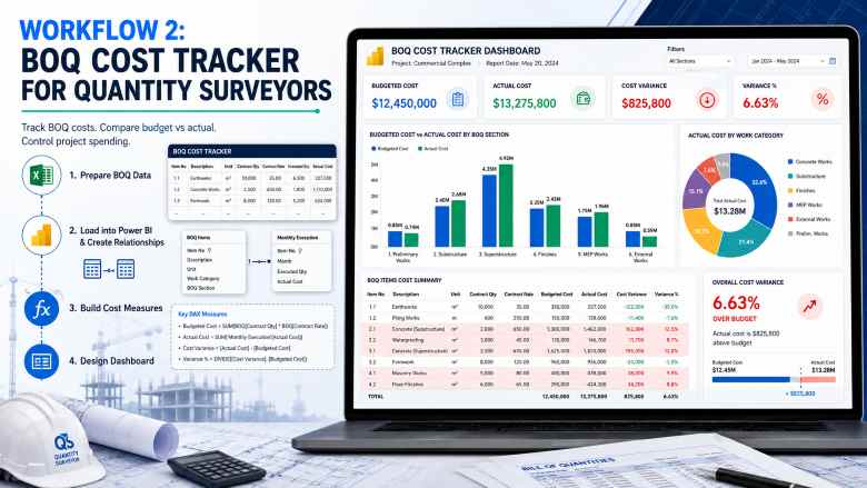
Step 1 — Prepare the BOQ data. Structure your Excel BOQ tracker with columns for Item Number, Description, Unit, Contract Quantity, Contract Rate, Executed Quantity to Date, and Actual Cost to Date. Ensure each row represents a single BOQ line item.
Step 2 — Load into Power BI and create relationships. Import the BOQ table. If you have a separate table for monthly execution quantities, import that as well and create a relationship between them using the Item Number column.
Step 3 — Build cost measures. Create DAX measures: Budgeted Cost = SUMX(BOQ, BOQ[Contract Quantity] * BOQ[Contract Rate]), Actual Cost = SUM(BOQ[Actual Cost to Date]), and Cost Variance = [Budgeted Cost] - [Actual Cost].
Step 4 — Design the dashboard. Use a clustered bar chart comparing budgeted versus actual cost by BOQ section, a table with conditional formatting highlighting items where actual cost exceeds budget, and a donut chart showing cost distribution by work category. Add a card showing overall cost variance percentage.
Workflow 3: Billing and Payment Tracker for Billing Engineers
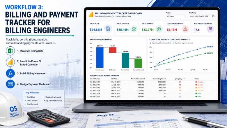
Step 1 — Structure billing data. Create an Excel table with columns for RA Bill Number, Bill Date, Gross Amount, Deductions, Net Certified Amount, Payment Received, Payment Date, and Status (Submitted/Certified/Paid/Pending).
Step 2 — Load and model in Power BI. Import the billing table. Create a calendar table using DAX: Calendar = CALENDARAUTO() to enable time-based analysis.
Step 3 — Build billing measures. Create measures for Total Billed, Total Certified, Total Received, Outstanding Amount, and Average Certification Days (the time between bill submission and certification).
Step 4 — Design the payment dashboard. Use a waterfall chart showing the flow from Gross Amount to Deductions to Net Certified to Payment Received. Add a line chart for cumulative billing versus cumulative payments over time. Include a table showing all pending bills with ageing indicators.
Try the Career Planner →
Beginner Training Path: From Zero to Dashboard in 8 Weeks
If you have never opened Power BI before, this structured learning path will take you from complete beginner to publishing your first project dashboard. The path assumes you have intermediate Excel skills — which most planning engineers, QS professionals, and billing engineers already possess.
Week 1–2: Foundations
Start with the free Microsoft Power BI learning paths on Microsoft Learn. Complete the “Get Started Building with Power BI” module first. Download and install Power BI Desktop (free) on your computer. Practice loading a simple Excel file and creating your first bar chart and card visual. Focus on understanding the three views: Report view, Data view, and Model view.
Week 3–4: Data Preparation and Modelling
Complete the “Prepare Data for Analysis” learning path on Microsoft Learn. Practice using Power Query to clean messy construction data — removing blank rows, splitting columns, changing data types, and merging tables. Learn to build relationships between tables (for example, linking an activity table to a WBS table). This is where your Excel pivot table experience translates directly.
Week 5–6: DAX Calculations and Visualisations
Learn core DAX functions: SUM, AVERAGE, DIVIDE, CALCULATE, FILTER, and SUMX. These cover 80 percent of what planning engineers need. Complete the “Model Data with Power BI” learning path. Build your first real project dashboard using exported schedule data from your current project. Focus on getting one S-curve chart and three KPI cards working correctly.
Week 7–8: Report Design, Publishing, and Sharing
Complete the “Design Effective Reports in Power BI” learning path. Polish your dashboard — apply consistent formatting, add meaningful titles, configure tooltips, and test all slicer interactions. If your organisation has a Power BI Pro licence, publish your dashboard to the Power BI Service and share it with your project manager for feedback.
Beyond Week 8: Advanced Skills
Once you are comfortable with the basics, explore these advanced topics: row-level security (restricting dashboard access by user role), paginated reports (for formal monthly reports that need to be printed), Power BI dataflows (for enterprise-level data pipelines), and integration with Microsoft Teams for embedding dashboards in project communication channels.
Recommended Courses for Construction Professionals
Beyond the free Microsoft Learn paths, these courses provide structured training with construction-specific context:
Microsoft Power BI Data Analyst Professional Certificate (Coursera) — This comprehensive programme from Microsoft covers the full PL-300 certification syllabus. Completers receive a 50% discount voucher for the certification exam. While not construction-specific, it provides the strongest foundation in Power BI skills. Enrol on Coursera →
Construction Project Management Specialization — Columbia University (Coursera) — Covers scheduling, cost control, BIM, and project planning fundamentals. Excellent for planning engineers who want to strengthen their overall project controls knowledge alongside analytics skills. Enrol on Coursera →
Primavera P6 Professional Fundamentals (Udemy) — Hands-on training for P6 users from beginner to intermediate level. Essential for planning engineers who want to strengthen their scheduling foundation before layering Power BI reporting on top. Browse on Udemy →
Excel to Power BI for Project Controls (Udemy) — Practical course bridging the gap between Excel-based reporting and Power BI dashboard creation. Particularly relevant for engineers transitioning from spreadsheet reporting. Browse on Udemy →
For a complete list of recommended learning resources, see our construction management courses guide.
Try Interview Copilot → One free session included. No credit card required.
Power BI vs Excel: When to Use Each Tool
A common question from planning engineers considering Power BI is whether it replaces Excel. The short answer is no — the two tools serve different purposes and work best together.
Use Excel when you need to perform ad-hoc calculations, build BOQ templates, prepare rate analysis sheets, enter and edit data manually, or create quick one-off analyses. Excel remains the primary data entry and calculation tool on construction sites.
Use Power BI when you need to visualise data interactively, combine data from multiple sources into a single view, share live dashboards with stakeholders who need to filter and explore data, automate weekly and monthly report production, and present performance metrics to management.
The ideal workflow for most construction teams uses Excel as the data backbone and Power BI as the presentation and analytics layer. Your P6 exports land in Excel, your BOQ tracker lives in Excel, your daily progress logs are in Excel — and Power BI connects to all of these files, transforming raw numbers into visual insights.
Skills That Complement Power BI for Planning Engineers
Power BI does not exist in isolation. To maximise the value of your analytics skills, consider developing these complementary capabilities:
Advanced Excel (Power Query and Power Pivot). Power Query in Excel uses the same M language as Power Query in Power BI. Learning it in Excel first provides a smooth transition. Power Pivot introduces DAX in an Excel context, which directly transfers to Power BI.
SQL basics. Many enterprise Power BI deployments pull data from SQL databases. Understanding SELECT, JOIN, WHERE, and GROUP BY statements enables you to write efficient queries and troubleshoot data issues.
Primavera P6 reporting. The more skilled you are at extracting and structuring data from P6, the better your Power BI dashboards will be. Understanding activity codes, user-defined fields, and global filters in P6 directly impacts the quality of your exported data. For P6 interview preparation, see our Primavera P6 interview questions guide.
Python (optional, advanced). For planning engineers interested in going further, Python scripting can automate data extraction from P6, perform advanced statistical analysis, and feed data into Power BI programmatically. This is an advanced skill that differentiates candidates at the senior project controls level.
Industry Adoption: Who Is Using Power BI in Construction?
Power BI adoption in construction has accelerated significantly. Microsoft reports that 97 percent of Fortune 500 companies use Power BI, and the construction sector is no exception. Major EPC contractors have built enterprise-level dashboards tracking everything from submittal status to procurement pipelines to safety KPIs across multi-project portfolios.
In the Gulf construction market, PMC firms and client organisations increasingly mandate Power BI dashboards as part of monthly progress reporting requirements. Planning engineers who can deliver these dashboards gain a measurable advantage in job selection and career progression.
In India, companies like L&T, Shapoorji Pallonji, and Tata Projects have adopted Power BI for project controls reporting. Mid-sized contractors are following, driven by competitive pressure and the availability of affordable Power BI training. For professionals exploring hybrid construction roles that bridge site work and digital reporting, Power BI proficiency is becoming a baseline expectation.
Getting Started: Your First Weekend Project
The best way to learn Power BI is to build something real. Here is a weekend project that any planning engineer can complete:
Saturday morning: Download and install Power BI Desktop. Export your current project’s activity list from Primavera P6 or MS Project to Excel. Open Power BI, load the Excel file using Get Data.
Saturday afternoon: Clean the data in Power Query (remove blank rows, set correct data types). Create two DAX measures — total activities and average percent complete. Build a bar chart showing percent complete by WBS element.
Sunday morning: Add a card visual for overall project progress. Add a slicer for discipline or contractor. Create a table showing activities with zero progress that should have started. Format everything with a clean colour scheme.
Sunday afternoon: Show the dashboard to a colleague or your project manager. Their feedback will be more valuable than any tutorial.
That single weekend exercise — connecting real project data to a real dashboard — will teach you more than weeks of theoretical study. And it will give you a concrete portfolio piece to reference in your next construction job interview.
Frequently Asked Questions
Why should planning engineers learn Power BI?
Planning engineers who learn Power BI can automate weekly and monthly progress reports, build interactive S-curve and earned value dashboards, visualise schedule variances in real time, and present data-driven insights to project stakeholders. These skills significantly reduce manual reporting time and strengthen career prospects in project controls roles across India, the Gulf, and international markets.
Which Power BI reports matter most for planning engineers?
The most impactful reports include the project S-curve dashboard (planned vs actual progress), earned value management (EVM) reports tracking SPI and CPI, look-ahead schedule summaries, delay analysis and critical path visualisations, resource loading histograms, and milestone tracker dashboards. For quantity surveyors, BOQ consumption and cost variance reports are equally critical.
Is Power BI Desktop free for planning engineers?
Yes. Microsoft Power BI Desktop is completely free to download and use. You can build dashboards, connect to Excel or Primavera P6 data exports, create data models, and design interactive reports without any licence cost. Sharing dashboards online through the Power BI Service requires a Pro licence (approximately $10/user/month), but many organisations already provide this as part of their Microsoft 365 subscriptions.
Can Power BI connect directly to Primavera P6 data?
Power BI does not have a native direct connector for Primavera P6. However, planning engineers commonly export P6 data to Excel or CSV files and import those into Power BI. For enterprise setups, organisations connect Power BI to the Primavera P6 Oracle database via ODBC or use middleware APIs. The Excel export method is the simplest approach and works well for most project-level reporting needs.
How long does it take to learn Power BI?
A planning engineer with intermediate Excel skills can build a functional project dashboard within two to four weeks of focused learning. The Microsoft Power BI Data Analyst path on Microsoft Learn takes approximately 40 to 50 hours. Most planning engineers become proficient enough to automate their regular project reports within eight to twelve weeks of consistent practice alongside their project work.
What is the salary impact of adding Power BI skills?
Planning engineers with Power BI and data analytics skills command a 15 to 30 percent salary premium compared to peers who rely solely on scheduling tools. In the Gulf region, senior planning engineers with dashboard capabilities earn between AED 18,000 and AED 30,000 per month. In India, the premium is especially significant for professionals targeting international EPC and PMC roles. See our highest paying construction jobs guide for detailed salary benchmarks.
What data sources do planning engineers connect to Power BI?
Common data sources include Primavera P6 exports (XER to Excel or CSV), Microsoft Project files, Excel-based BOQ and billing trackers, SharePoint lists, ERP system databases (SAP, Oracle), daily progress log spreadsheets, safety incident registers, and material delivery trackers. Power BI supports over 100 data connectors, making it flexible enough to consolidate data from multiple project systems.
Is Power BI better than Excel for construction project reporting?
Excel remains essential for data entry, calculations, and ad-hoc analysis. Power BI excels at interactive visualisation, automated report refresh, consolidating data from multiple sources, and sharing live dashboards with stakeholders. The ideal workflow combines both — Excel for schedule data, BOQs, and billing inputs, and Power BI for visual reporting and stakeholder presentations.
Recommended Resources
Official Training and Documentation
Microsoft Power BI Learning Paths (Microsoft Learn) — Free, structured learning paths covering fundamentals through advanced topics.
Power BI Documentation (Microsoft Learn) — Comprehensive reference documentation for all Power BI features.
Download Power BI Desktop (Free) — The desktop application where you build all dashboards and reports.
Career Resources from ConstructionPlacements
Planning Engineer Job Description and Salary Details
55 Planning Engineer Interview Questions and Answers
Top 50 Primavera P6 Interview Questions & Answers
Quantity Surveyor Job Description and Salary Details
Billing Engineer Job Description and Salary Details
Construction Scheduling Software: 10 Best Tools Compared
Courses for Construction Management — Complete Guide
150+ Construction Job Titles & Descriptions
Hybrid Construction Roles: Site to Screen Career Guide
Top 50 Project Management Interview Questions
Ebooks for Construction Career Growth
📘 Civil Engineering Career Handbook — Career roadmap covering specialisations, certifications, salary insights, and growth strategies for civil engineers and construction professionals.
📗 Construction Interview Preparation Guide — Comprehensive Q&A guide with technical and HR questions for planning, QS, site, BIM, and project management roles.
📦 Complete Career Bundle (Best Value) — Get the Civil Engineering Career Handbook and Interview Guide together at a discounted bundle price.
🌍 Remote & International Construction Jobs Guide — Strategies and resources for landing construction roles in the Gulf, UK, Australia, and international markets.
Conclusion
Power BI is not a passing trend in construction project controls — it is rapidly becoming a baseline professional skill alongside Primavera P6 and advanced Excel. For planning engineers, quantity surveyors, and billing engineers, the ability to transform raw project data into interactive, insightful dashboards is a career accelerator that delivers immediate value to your project team and long-term value to your professional trajectory.
The barrier to entry is remarkably low. Power BI Desktop is free. Microsoft Learn provides free, world-class training. You already have the project data in your Excel files and P6 exports. The only investment required is your time — and the return on that investment, in terms of both daily productivity and career advancement, is substantial.
Start this weekend. Export your schedule data, build your first S-curve, and show it to your project manager. That single step will tell you more about the value of Power BI than any article ever could.
Build your career toolkit: Explore AI-powered career tools at ConstructionCareerHub.com — including the Resume Lab, Interview Copilot, and Career Planner — designed specifically for construction professionals looking to stand out in a competitive market.